_edited.png)
The Human Side of Data
- pattka223
- Sep 25, 2025
- 3 min read

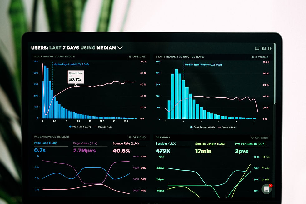
Data is everywhere. Dashboards, reports, metrics, KPIs, it’s the language of modern work. In healthcare, it’s even more pronounced. We track outcomes, measure efficiency, and analyze trends with the hope of improving lives. But here’s the truth: data isn’t just numbers on a screen. It’s people. Behind every chart is a story. Behind every percentage point is a human being whose life is affected by the decisions we make.
The Problem with Numbers Alone
The danger in a data-driven world is forgetting what’s behind the digits. When we reduce everything to percentages and graphs, we risk losing sight of the human beings they represent.
A “readmission rate” isn’t just a statistic, it’s a patient who had to return to the hospital, perhaps frightened or frustrated, with their family once again rearranging their lives to support them. A “time-to-treatment” metric isn’t just a line on a graph, it’s a loved one waiting anxiously, hoping the system moves quickly enough to bring relief.
Too often, we celebrate when the numbers move in the “right” direction without pausing to ask the deeper question: What story is this data really telling?

A Shift in Perspective
I’ve learned that the most powerful way to work with data is to treat it as a lens, not a verdict. Data should guide us, not define us. It can point out where to look closer, but it can’t capture the full context of a lived experience.
This realization became even more personal for me during my pregnancy. At the time, I was helping to implement a workflow that ensured breast pumps were delivered to new mothers within 24 hours of giving birth. On paper, it was about tracking delivery times, flagging gaps, and monitoring whether the technology helped or hindered the process. But as I looked at the data, where we missed the mark, where the system succeeded, I wasn’t just a healthcare professional analyzing a workflow. I was a mother-to-be who knew that within months, I could be the patient on the other end of that metric.
It wasn’t just about logistics. It was about the experience of a new mom in one of the most vulnerable and important moments of her life. The questions weren’t only, What are the risks? Where is the gap? but also, What does this feel like for the mother? How does it impact her baby? What’s the benefit of getting this right?
That’s when the numbers came alive because they represented real people, real families, and real care.
Lessons That Apply Everywhere
While my examples often come from healthcare, this principle applies universally.
In finance, a credit score is not just a risk metric, it represents someone’s years of hard work, mistakes, recoveries, and dreams of buying a home.
In education, a graduation rate isn’t just a percentage, it’s students overcoming barriers, long nights studying, and families celebrating a milestone that once felt impossible.
In tech, “user engagement” isn’t just clicks and views, it’s people finding connection, learning, or building opportunities.
No matter the industry, the takeaway is the same:
Data is powerful, but it’s not the hero.
People give data its meaning.
Technology should amplify human care, not replace it.
The next time you open a dashboard or glance at a report, pause. Don’t just see numbers, listen for the story they’re trying to tell. Ask yourself: Whose life is reflected here? What does this data say about their journey, their challenges, their victories?
Because when we keep the human side of data in focus, we don’t just make better decisions, we design systems that truly serve. We move from spreadsheets to stories. From outcomes to impact. From numbers to meaning.
And that’s when data fulfills its highest purpose: not just to measure, but to matter.


Comments